MK-CK5 Production Office
Architecture: agaligo studio | Landscape Architecture: OpenBox | Interior Design: Storage Studio | Lighting Design: Studio Accent | Graphic Design: Work In Bangkok
Location: Samutprakarn, Thailand (13°35'43.84"N, 100°47'9.68"E)
Area: 3,023 Sq.M.
Year: 2013
Photographs: Spaceshift Studio

To celebrate the transformation of a private organization to a brand new public company, MK Restaurants Group PCL decided to establish a new Central Kitchen, CK5. MK Restaurants is widely known in Thailand for 27 years for serving high quality, affordable hot pot meals as well as pioneering many innovative movements. It was the first restaurant chain to implement the use of electric pots, handheld ordering devices, induction stoves, self-ordering table tablet technology, robot service staff, and etc. One of MK’s earliest creations that eventually become its brand signature is the red trays, also called the “condo,” that are able to stack up vertically, allowing easier storage, convenience in serving, and extra space on the dining table. Designed by the owner himself since the early days of the business, it proves an inventive substitute for the impractical round plates. The use of the red condos is now common in every hot pot restaurants throughout Thailand, and is often imitated by the competitors.
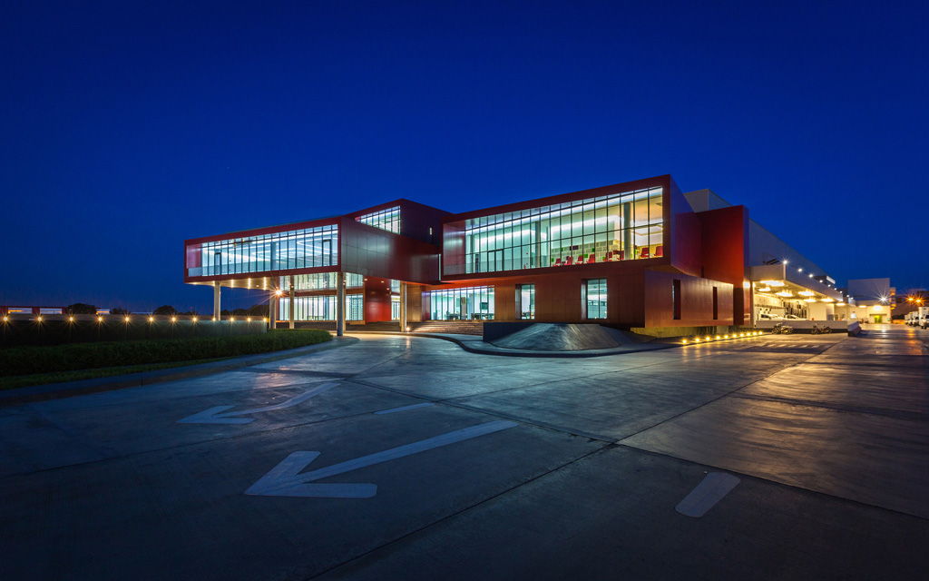
CK5 project is located on Bangna-Trad highway. The infrastructure is designed to embrace the brand signatures of MK and is composed of two buildings attached together— the Central Kitchen and the main office building. The client made a requirement that this project not only be just another industrial kitchen with an office, but also a live museum to welcome visitors who are interested in MK Restaurant’s efficient food production and distribution system. On top of that, the client requested that the office building play the “leading actor” role of the project.
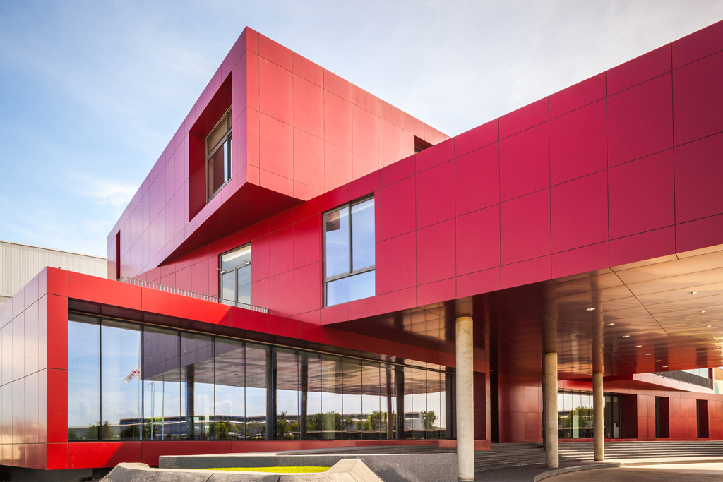
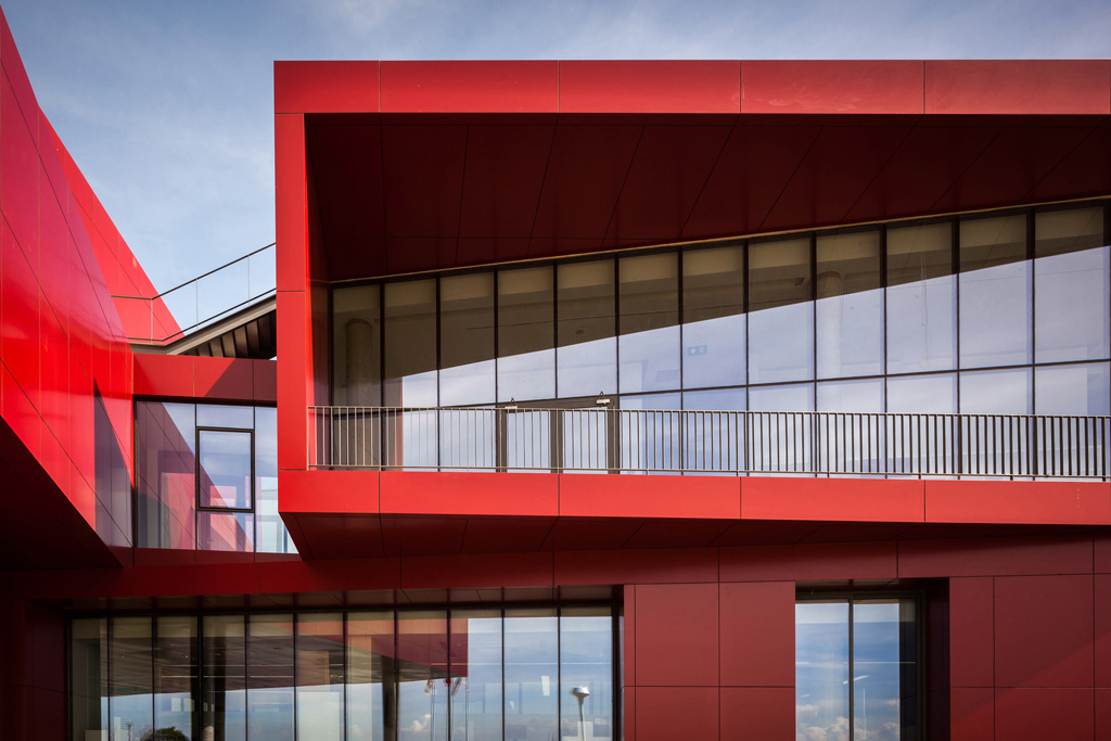
To fulfill this excitement, from the architectural point of view, MK needed a new building with a lucid formal expression in order to capture the public attention. The design should demonstrate that the company has achieved another level of success and that it is ever ready to progress to the grander realm. Fresh, interesting, meaningful, and above all, easy to read should be the keywords of this building’s architecture. The concept of “Red Boxes on The Move” was therefore proposed to the client in the first meeting. It was so well received that it has never changed ever since.

The building consists of six red functional boxes: exhibition, office, meeting, conference, experiment, and transition. Dark red aluminum composite panels were used for external wall cladding. Certain-coded dark red color was purposely selected to reconcile with the color of MK’s signature condo. The building is oriented to avoid direct sunlight while the large windows are positioned to face the north in order to admit natural light, reducing the use of artificial bulbs. The circulation of the building was designed to allow visitors to be able to closely observe the food production system without interference and also to participate in certain stations during the facility tour. VRF (Variable Refrigerant Flow) air conditioning system was installed throughout the building for better energy saving. Positive air pressure is maintained at all times to ensure moisture and unwanted matters and germs do not enter the building.

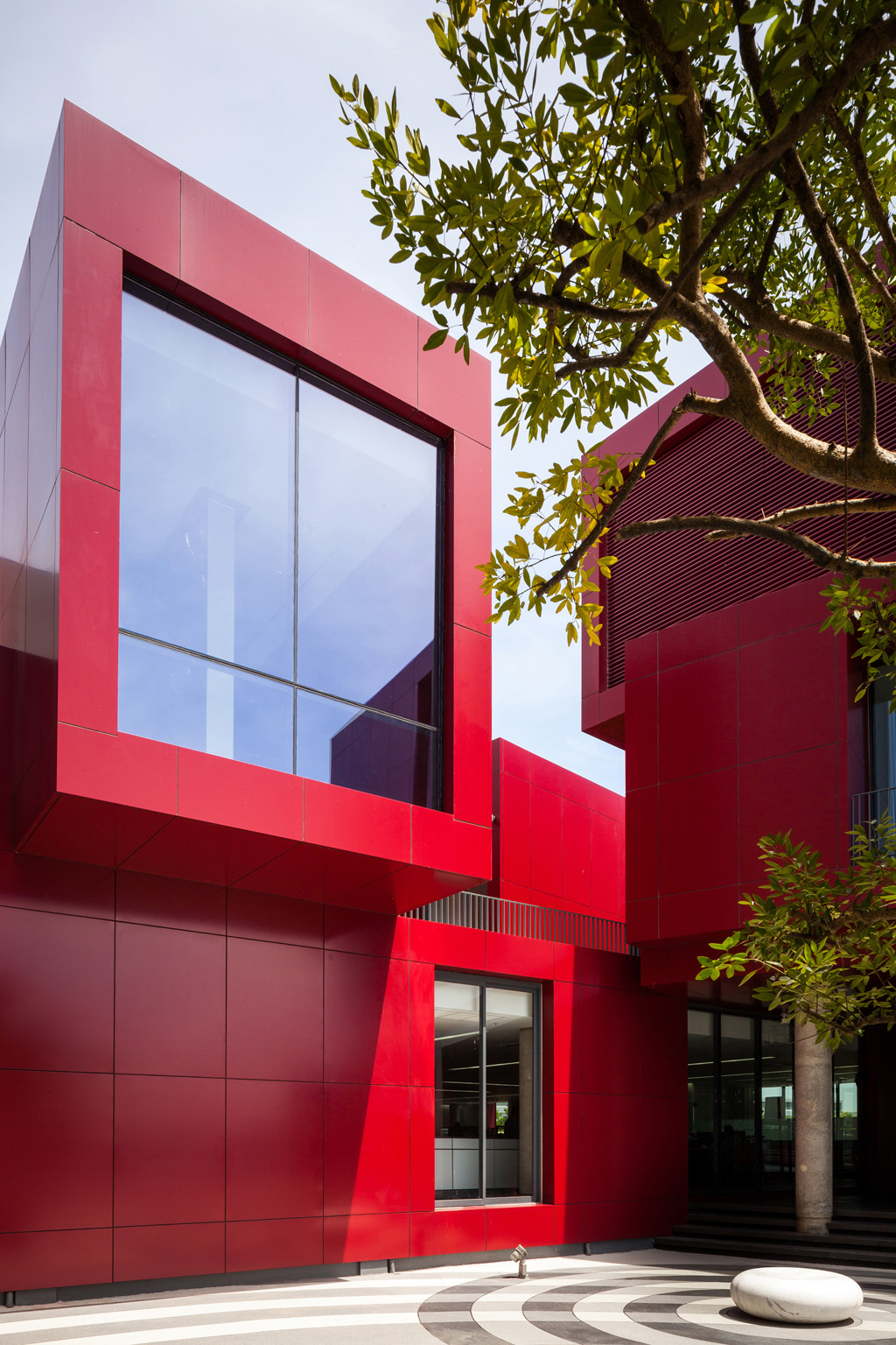

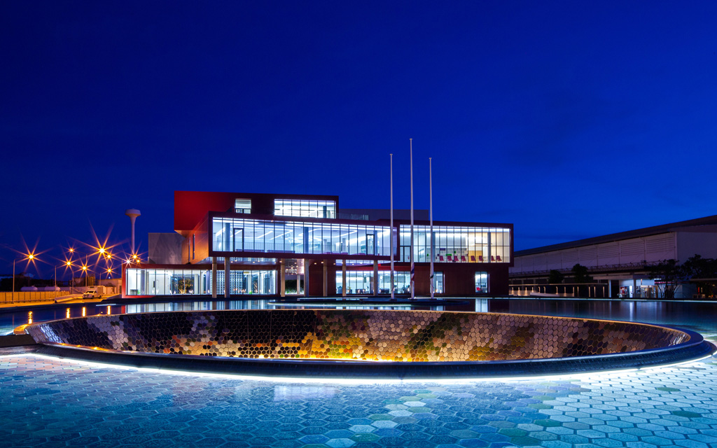
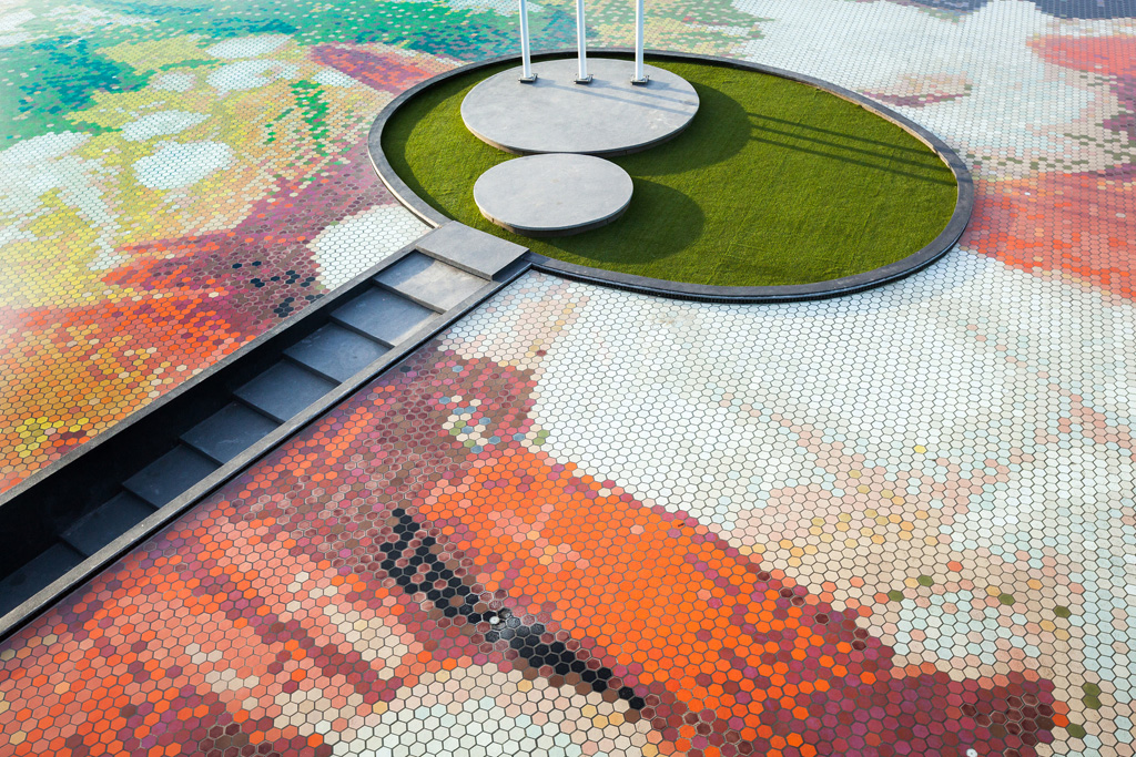
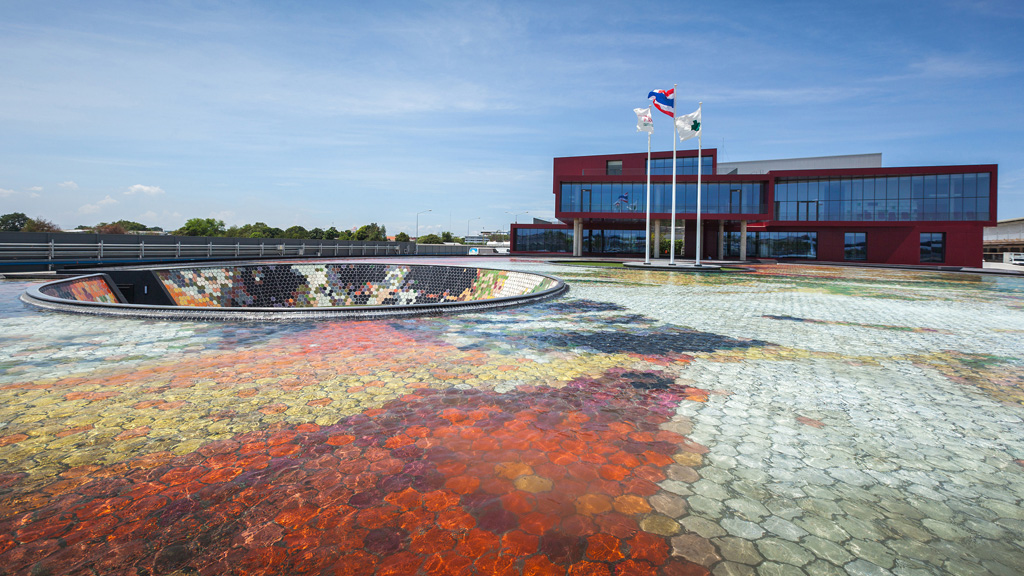
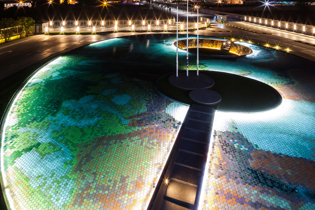
Landscaping also plays a significant role to enhance the core concept. The area around the main office building represented a hot pot table. A large, shallow pool in an oval shape was laid out to symbolize a suki pot. The tiling pattern was derived from a boiling pot full of food ingredients. Through computer programming, a pixelated image was generated to produce a series of tiling matrices, and using this series to govern the overall pattern, colorful hexagonal tiles were then meticulously arrayed on the inner side of the pool.

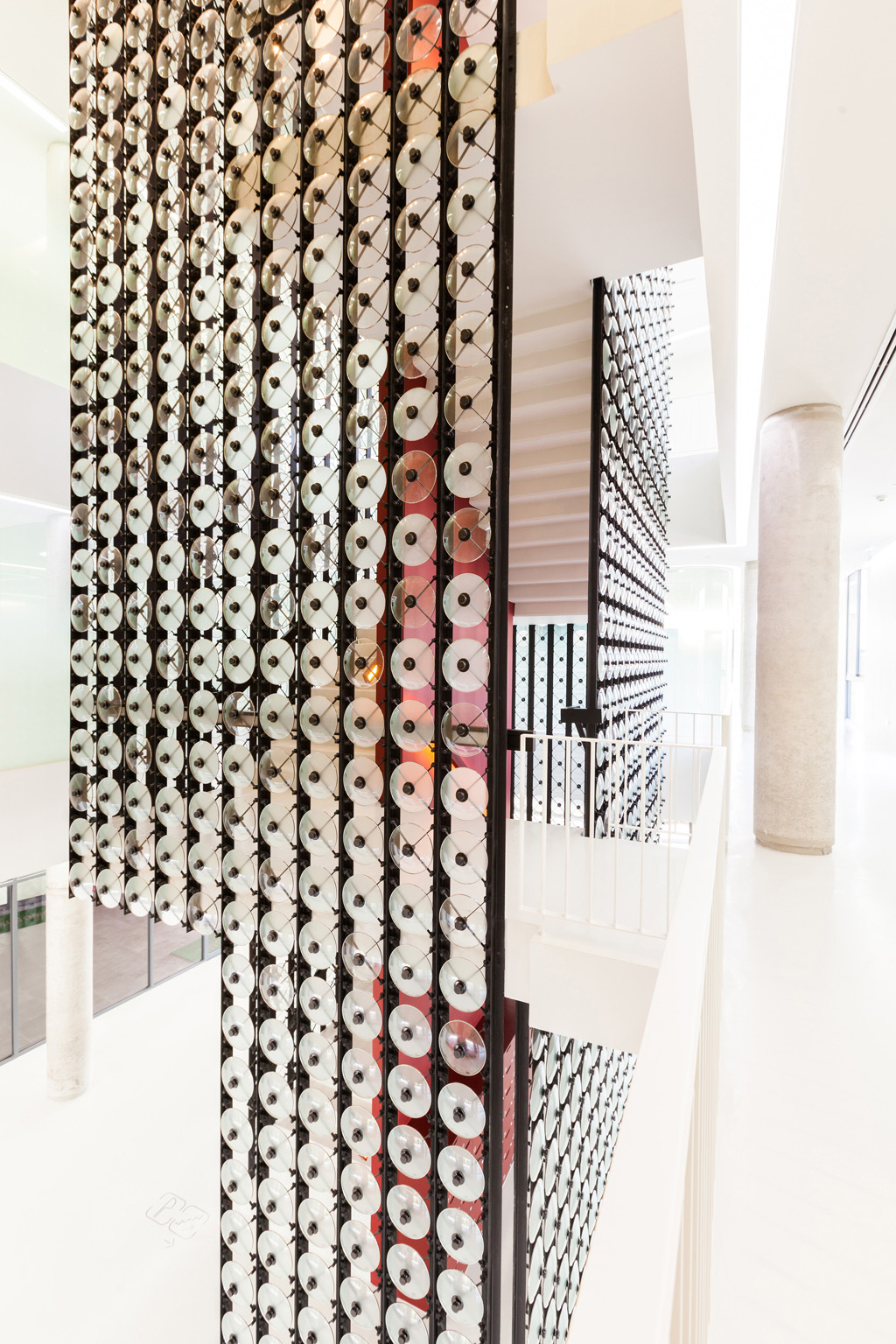
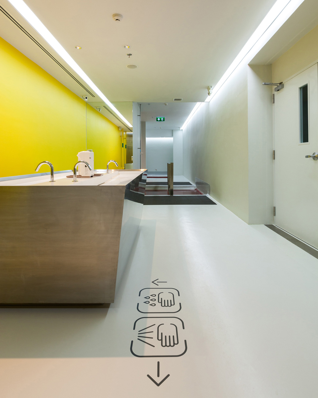
The interior of the building mainly adopted the open planning concept. The main staircase is wrapped from ground level to the top floor with a translucent screen made of more than 2,000 reclaimed old-unused pot lids. The meeting rooms of the same shape of the condo were discreetly exhibited around the main stairs. Built with glass walls printed with a gradient white pattern, the setup provides semi-privacy as well as suggests an ambience of boiling steam, having its white gradient covering the lower part of the glass. Additionally, in guiding the guests around the office space, directions are advised via the graphics on the floor, leading visitors to the Central Kitchen through a transitional hygiene room and an introductory mini theater.
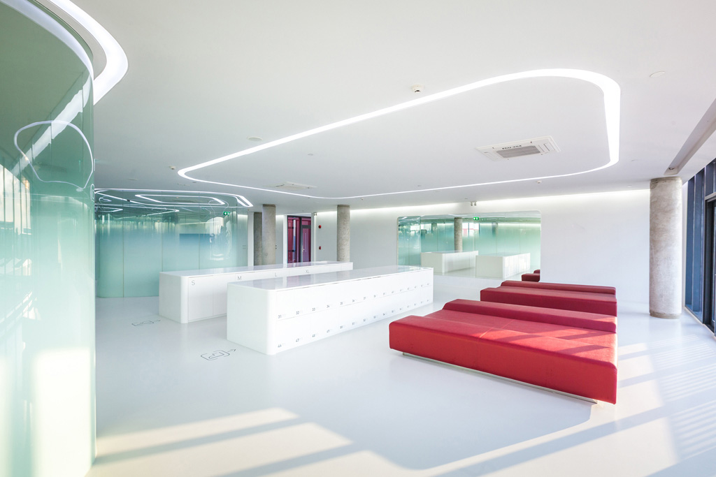

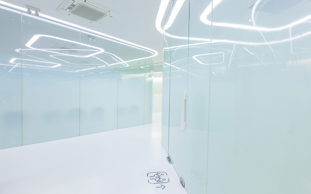
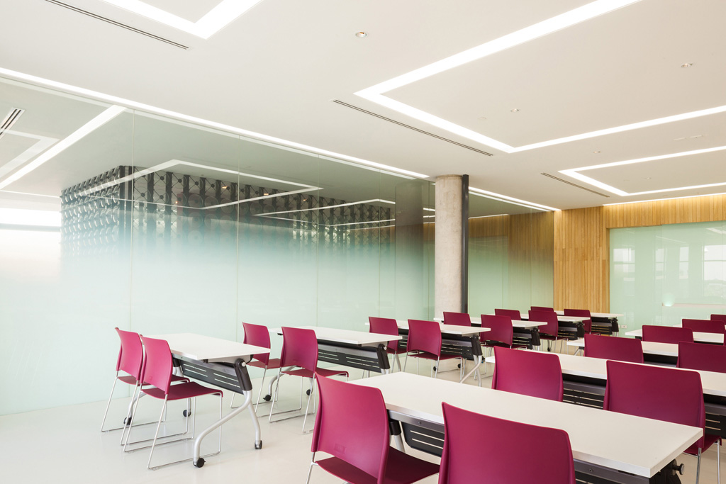


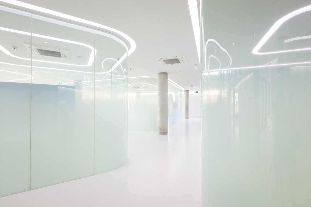
Since the whole infrastructure supports a full work operation at night due to its food production nature, guests usually start their visit around 4am, a rather unusual operating time for an office building. This requirement calls for an intensive lighting design for both exterior and interior spaces. The lighting design for the exterior supported the architectural forms, and therefore, there is no visibility of light sources, and only planes, masses, objects, and spaces are lit. Meanwhile, the interior lighting design plays another role. The interior lighting gives a sense of glow from the inside out. Interior light sources are graphically arranged to conform to the room functions and furniture layouts in order to celebrate the activities inside the building.
